Blogs:JaroslavTulach:Daily Life:NewLookAndFeel
From APIDesign
New L&F of apidesign.org
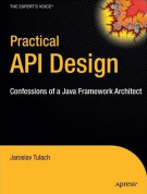
There was a lot of factors that influenced me last year, when I was searching for publisher of my book. However one of them must have been slickness of cover. I really like the black and yellow style of Apress books. I like it so much that I decided to make it the default Look and Feel of the apidesign.org website.
I'd started with Monobook theme and modified it to be a bit darker. I do not code CSS for living, but CSS file editing support in NetBeans IDE is good, so it was quite entertaining experience. I am sure not everything is perfect, but I'll keep fixing problems as they appear. If you notice something ugly or broken, let me know.
<comments/>


